In order to bring together the different pieces of the app that I’ve created so far, I wanted to focus next on creating the “homepage” of the app, where users would be able to see the different recipes and lists they have created, navigate between them, and update them as desired. I also wanted to more fully integrate react-router into my app, and this seemed like the perfect time to get started.
The Navbar
Every good app needs a navbar, and mine is no different. I wanted to take the specifications designed by my brother and update them a bit to fit the needs of the project as it currently exists. To that end, I envisioned a top bar with a menu, a searchbar and the ability to quickly and easily navigate between the user’s Recipes, their Grocery Lists, and the Ingredients available to them.
I began by implementing the search bar and the menu, making use of Material-UI’s icons and components.
<Box className={classes.searchbar} mx={1}>
        <InputLabel>
          <Grid container>
            <Grid item>
              <NavMenu buttonLabel={<DehazeIcon />}/>
            </Grid>
            <Grid item>
              <SearchIcon className={classes.searchIcon}/>
            </Grid>
            <Grid item xs={8} md={10}>
              <InputBase className={classes.searchInput} placeholder="Search..." />
            </Grid>
          </Grid>
        </InputLabel>
      </Box>
This created a search bar that should look pretty familiar to anyone who has spent any time around web apps:

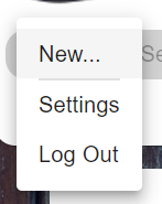
The NavBar component was created separately, and consists of a few different options, including the ability to create a new list/recipe, access to the Settings page, and the option to log out.
const NavMenu = (props) => {
  const classes = useStyles()
  const [anchorEl, setAnchorEl] = useState(null)

  const handleClick = (event) => {
    setAnchorEl(event.currentTarget)
  }

  const handleClose = () => {
    setAnchorEl(null)
  }

  return (
    <div>
      <Button
        className={classes.root}
        aria-controls="nav-menu"
        aria-haspopup="true"
        onClick={handleClick}>
          {props.buttonLabel}
      </Button>
      <Menu
        id="nav-menu"
        anchorEl={anchorEl}
        keepMounted
        open={Boolean(anchorEl)}
        onClose={handleClose}>
          <MenuItem>New...</MenuItem>
          <Divider variant="middle" />
          <MenuItem>Settings</MenuItem>
          <MenuItem>Log Out</MenuItem>
      </Menu>
    </div>
  )
}
It’s all nonfunctional right now, but not for long. I’m still just trying to get the feel of everything nailed down.
Tabs and Routing
Next, I wanted to add a way for the user to quickly navigate between several different collections of equal importance. The Material-UI Tab component seemed ideal to the task. This was also where I wanted to implement routing, as I wanted changing the tab to change the route that the page was on.
My first challenge was to integrate these two libraries. The Tabs component required a value in order to display the current tab to the user, and that value would need to persist over time. Furthermore, the Link component used by react-router is not the same thing as the Tab component used by Material-UI.
This is one of those case studies in why it’s important to always check StackEchange before cooking up some convoluted solution on your own. Initially I was worried I was going to have to implement Redux and store a value in state and it was going to be this whole thing. Luckily, I found this post which discussed exactly what I was looking for. The solution was to use the withRouter method to wrap my Tabs component, allowing access to history methods. In doing so, I could use the current pathname of the route as my value for the Tabs component. Then, I was able to use the component prop provided by Material-UI to render the Tab component as a Link component, efficiently combining them:
const NavBar = (props) => {
  const [value, setValue] = useState(0)

  const handleChange = (event, newValue) => setValue(newValue)

  return (
      <Tabs value={props.history.location.pathname} onChange={handleChange} centered>
        <Tab component={Link} label="Recipes" to="/recipes" value="/recipes"/>
        <Tab component={Link} label="Lists" to="/lists" value="/lists"/>
        <Tab component={Link} label="Ingredients" to="/ingredients" value="/ingredients" />
      </Tabs>
  )
}
The only small thing that gets me about this solution is that I have to repeat the route twice: once with the Tab label component, and once with Link’s to component. For a full DRY refactor, I would create a component and then reuse it for this, and I may go back and make that change later. It’s not a big deal, but it’s something I want to keep in mind.
I placed my tabs underneath the search bar and added a squiggle on top to keep with the overall theme of the app:

Creating a General Template Page
Having new routes is all very well and good, but it doesn’t do much if there is nothing on those pages. Because they were going to be functionally the same, save for the differences in what they were displaying, I wanted to create an overall template page that I could then customize to my liking. This template would have my navbar component and the wooden background, and would serve as a signifier that the user was in the “top level” of the app.
My base template was fairly simple:
const useStyles = makeStyles({
  root: {
    backgroundImage: 'url('+ woodBackground + ')',
    backgroundRepeat: 'no-repeat',
    backgroundSize: 'cover',
    backgroundColor: "#a8d4ff",
    backgroundBlendMode: "multiply",
    height: "100vh",
    width: "100vw",
  },
})

const MainTemplatePage = (props) => {
  const classes = useStyles()
  return (
    <div className={classes.root}>
      <SearchBar />
      <Container>
        <Grid container>
          {props.children}
        </Grid>
      </Container>
    </div>
  )
I used a Grid component because I’m conceiving of each of these three pages to show a grid of available resources. My goal is to create a component that uses the <Grid item> component, which should allow everything to nicely fit together. And I started working on that component (as you can see in the repo), but I decided that before I do that, I need to give users the ability to actually log in to the damn thing. But that’s for next post.
Next Steps
- allow users to log into the app
- display the user’s resources when logged in