At long last, it’s time to begin work on the front end of my Grocery List App. This has been a long time coming, but with several other, smaller, React projects under my belt, I felt that it was time to take on something bigger.
In preparation for this project, I spoke with my brother, who is currently studying to be a graphic designer. He was kind enough to draft up some mockups for how the site would work, and I’m going to be using those as the base for how I’m going to build the site.
The first page I decided to work on was the List Page.
Building the List Page
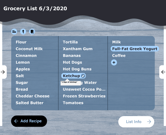
First, my brother’s mockup for how the page would look:

This page displays the ingredients of a grocery list. The ingredients are shown in the middle, and when hovered over they display the full name and an option to edit them. When clicked, they show the lines that the ingredients came from. There are also options to add a recipe to the list, get the info of the list, and share and copy the list. The two side panels provide quick access to these features.
The first thing I did was break up the page into a series of components: there would be the top bar (with the name), the first small toolbar, the actual list panel, and the two buttons on the bottom. I added these from top to bottom.
The Top Panel
Using the assets my brother provided, I first created the component for the top panel, titling it “TopSquiggle.” This was a very simple component, making use of the makeStyles function to modify a Material-UI Typography component.
const useStyles = makeStyles({
  title: {
    color: "white",
    position: "absolute",
    top: "15px",
    left: "30px"
  },
  image: {
    width: "100%",
    height: "12vh",
  }
})

export const TopSquiggle = (props) => {
  const classes = useStyles()
  return(
    <div>
      <img src={topSquiggle} className={classes.image}/>
      <Typography variant="h4" className = {classes.title}>
        {props.children}
      </Typography>
    </div>
  )
}
(I wanted to continue using Material-UI for this project, but the assets I was working off of would require a much greater level of custom styling.)
This created a simple top bar that would hold the title of the grocery list. Here’s a screenshot (plus a wooden background that I pulled from a free asset site).

The Top Toolbar
The top toolbar consists of three icons. I pulled these icons from the provided assets, but to be honest I might go back and replace them with the provided Material-UI svg icons, which have additional levels of support and customization that I don’t want to spend a lot of time adding right now.
The buttons are implemented with the Material-UI ButtonBase class, with minor styling to round them out. Because they currently do nothing, I put them all in a single file:
const useStyles = makeStyles({
  root: {
    borderRadius: "100%"
  }
})

export const CopyButton = () => {
  const classes = useStyles()
  return (
    <ButtonBase className={classes.root}>
      <img src={copyIcon} height={30} />
    </ButtonBase>
  )
}

export const ListButton = () => {
  const classes = useStyles()

  return (
    <ButtonBase className={classes.root}>
      <img src={listIcon} height={30} />
    </ButtonBase>
  )
}

export const ShareButton = () => {
  const classes = useStyles()

  return (
    <ButtonBase className={classes.root}>
      <img src={shareIcon} height={30} />
    </ButtonBase>
  )
}
The actual panel is just a series of nested Box components, with the display attribute set to “inline” to keep them on the same row.
const ListModificationPanel = () => {
  return (
    <Box m={1}>
      <Box m={1} display="inline">
        <CopyButton />
      </Box>
      <Box m={1} display="inline">
        <ListButton />
      </Box>
      <Box m={1} display="inline">
        <ShareButton />
      </Box>
    </Box>
  )
}

export default ListModificationPanel
This creates a nice panel that is virtually identical to the the one on the mock design.

The List Panel
The List Panel is the only component so far that has a significant amount of logic in it. I wanted the list of ingredients to be split up into several rows, depending on how many ingredients there were. This required some way to split an array into a set of equally sized sub-arrays. I checked online and ultimately implemented a version of the solution presented in this Medium post.
const chunkedAr = []
for (let i = 0; i < listItems.length; i++){
  const last = chunkedAr[chunkedAr.length-1]
  if(!last || last.length === size){
    chunkedAr.push([<IngredientButton key={i}>{listItems[i]}</IngredientButton>])
  } else {
    last.push(<IngredientButton key={i}>{listItems[i]}</IngredientButton>)
  }
}
(The IngredientButton component holds the logic for each individual list item, and we’ll get there in a moment.)
From there, I added the “plus” component icon on at the end of the list, with a Box to ensure that the spacing was consistent.
if (chunkedAr.length > 0){
  chunkedAr[chunkedAr.length-1].push(
    <Box mx={1}>
      <PlusButton />
    </Box>
  )
}
Finally, each sub-array was mapped onto a Grid component to split them evenly, and placed inside of a Paper component to give the panel a good feel.
const columns = chunkedAr.map((ingredients, i)=>(
  <Grid item key={i} className={classes.gridItem}>
    {ingredients}
  </Grid>)
)


return (
    <Paper variant="outlined" className={classes.root}>
      <Grid container spacing={3}>
        {columns}
      </Grid>
    </Paper>
  )
}
I added a bit of custom styling to the larger component to give it the same look and feel as the mockup, and the basic look was down:

The ingredients you see here are actually from my backend; I implemented a very simple fetch request to the first list in the database for testing purposes:
const[listItems, setListItems] = useState([])
  const[listName, setListName] = useState("")

  useEffect(()=>{
    fetch("http://localhost:5000/ingredients?list=1")
      .then(response=>response.json())
      .then(data => {
        console.log(data)
        setListItems(data)
      })

    fetch("http://localhost:5000/lists/1")
      .then(response=>response.json())
      .then(data => {
        console.log(data)
        setListName(data.name)
      })
  }, [])
There are two fetch requests here: The first is for the items in the list, and the second is for the name of the list. One thing that I would like to be thinking about for the future is implementing a more all-inclusive way to retrieve data. The current method nicely separates everything but requires a number of additional calls, which could potentially overwhelm the backend. Changing how requests are made would also give me the option to version my API, but that’s a post for another time.
The List Buttons
Next up is the IngredientButton component, which is used to display each ingredient on the grocery list. The mockup has the ingredients displayed in white text at first, when then reverses and is highlighted when hovered over. A small pen icon also appears to show the user that this ingredient can be edited. If the ingredient is cut off due to space constraints, the highlighted ingredient is displayed in full.
I chose to implement this with a Box showing the ingredient name, with a Button component that is superimposed over it when the mouse is hovered over it. This way, the button can display slightly different text (e.g. the ingredient name in full) and escape past the bounds of the column the ingredient is a part of. I used onMouseEnter and onMouseLeave calls to check if the mouse was over the ingredient, and a single piece of state to determine whether or not to render the Button. This component also required more custom styling than any other so far.
const useStyles = makeStyles({
  root: {
    fontFamily: "Acari Sans, Verdana",
    fontWeight: "bold",
    fontSize: "20px",
    color: "white",
    padding: "5px",
    borderRadius: "25px",
    textAlign: "left",
    width: "100%"
  },
  textBox: {
    textOverflow: "ellipsis",
    whiteSpace: "nowrap",
    overflow: "hidden",
    maxWidth: "100%",
    display: "inline-block"
  },
  hover: {
      backgroundColor: "white",
      color: "black",
      position: "absolute",
      zIndex: "5",
      left: "0px",
      top: "0px",
      width: "auto"
  }
})

const IngredientButton = (props) =>{
  const [hovering, setHovering] = useState(false)

  const classes = useStyles()

  const display = hovering ?
  <ButtonBase
    onMouseLeave={()=>setHovering(false)}
    className={clsx(classes.root, classes.hover)}>
    {props.children}
    <EditIcon />
  </ButtonBase>
  : null


  return(
    <Box px={1} position="relative" className={classes.root}>
        <Box
          component="span"
          className={classes.textBox}
          onMouseEnter={()=>setHovering(true)}>
          {props.children}
        </Box>
      {display}
    </Box>
  )
}
There are still some kinks to work out here, primarily in having the button float free of its parent elements and making sure the button disappears when the mouse leaves it. But the effect looks nice and is broadly what I’m going for:

The Bottom Buttons
Last but not least are the two buttons on the bottom of the page. Because there will be a lot of buttons like them throughout this app, I created a base template out of the Button Material-UI class. At first I used the ButtonBase class, but that didn’t give support for the color attribute, and I wanted to use a custom theme, so I switched to the more complete Button. Right now, the theme is extremely basic, and only includes the primary and secondary colors:
const theme = createMuiTheme({
  palette: {
    primary: {
      main: blueGrey[800]
    },
    secondary: {
      main: brown[100]
    }
  }
})

export default theme
Likewise, the ButtonTemplate uses a number of custom styles (some of which I plan to migrate to the theme) to return a version of the button better suited to the app’s look.
const useStyles = makeStyles((theme) => ({
  root: {
    fontWeight: "bold",
    borderRadius: "25px",
    padding: "10px 15px",
    fontFamily: "Verdana",
    textTransform: "capitalize"
  }
}))

const ButtonTemplate = (props) => {
  const classes = useStyles()

  return (
    <Button
      variant="contained"
      color={props.color}
      className={classes.root}>
      {props.children}
    </Button>
  )
}
This allows me to pass in colors and text as necessary, as can be seen for the two buttons on the bottom:
const AddRecipeButton = () => {
  const theme = useTheme()
  return (
    <ButtonTemplate color="primary">
      <ArrowBackIcon style=/>
      Add Recipe
    </ButtonTemplate>
  )
}

const ListInfoButton = () => {
  return (
      <ButtonTemplate color="secondary">
        List Info
        <ArrowForwardIcon style=/>
      </ButtonTemplate>
  )
}
(Note also that both of these use Material-UI icons.)
I used a couple of Boxes and a float: right style to set up the bottom, like so:
<Box my={3}>
  <AddRecipeButton />
  <Box display="inline-block" className={classes.rightFloat}>
    <ListInfoButton/>
  </Box>
</Box>
This creates two nice buttons on the bottom of the screen:

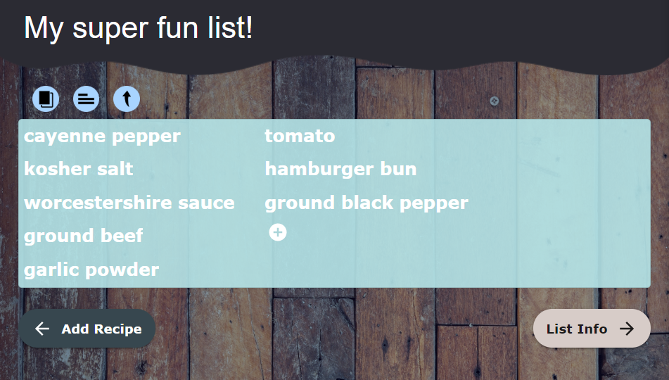
And that’s it! Taken together, here’s the current look of the list page:

Overall, this is pretty close to the mockup and I’m pleased with how it came out. While there are still a few kinks to work out, I want to focus on getting it functional before giving everything a coat of polish.
Next Steps
- add the ability to log in
- retrieve the recipe line when the icon is clicked on
- add the ability to modify the grocery list
- all of the rest of the pages (!)
Everything that I have here is uploaded to my GitHub here if you have questions or want to take a look at my code.