As my last project before beginning on the front end of my web app, I wanted to build a small project that I’ve been thinking about for a while. I like to write short fiction, but sometimes it can be difficult, especially at the beginning, to feel inspired and to think about what to write next. I wanted to create a small app that provides inspiration, and maybe more easily provokes the sensation that you’re discovering a new story, rather than simply trying to force one.
To that end, I want to build an app that guides you through a simple “writing sprint.” This is a specified amount of time during which you write as fast as possible and keep editing to an absolute minimum. The goal is simply to get something on the page that you can go back to and work on later. Additionally, however, I wanted to provide some kind of initial jolt of inspiration, something to get you started on a new topic.
To that end, my app will need to have several basic features:
- The ability to select a sprint length and then count down,
- The ability to write, and some kind of way to prevent too much editing,
- A form of inspiration that is different from a simple writing prompt,
- The ability to save, copy, or download your sprint after completing it.
I decided to continue using Material-UI for this project, since I want to continue growing my knowledge of it. As with my calculator, I wanted to first spend time getting the look down before working on adding in the functionality.
Planning the Components
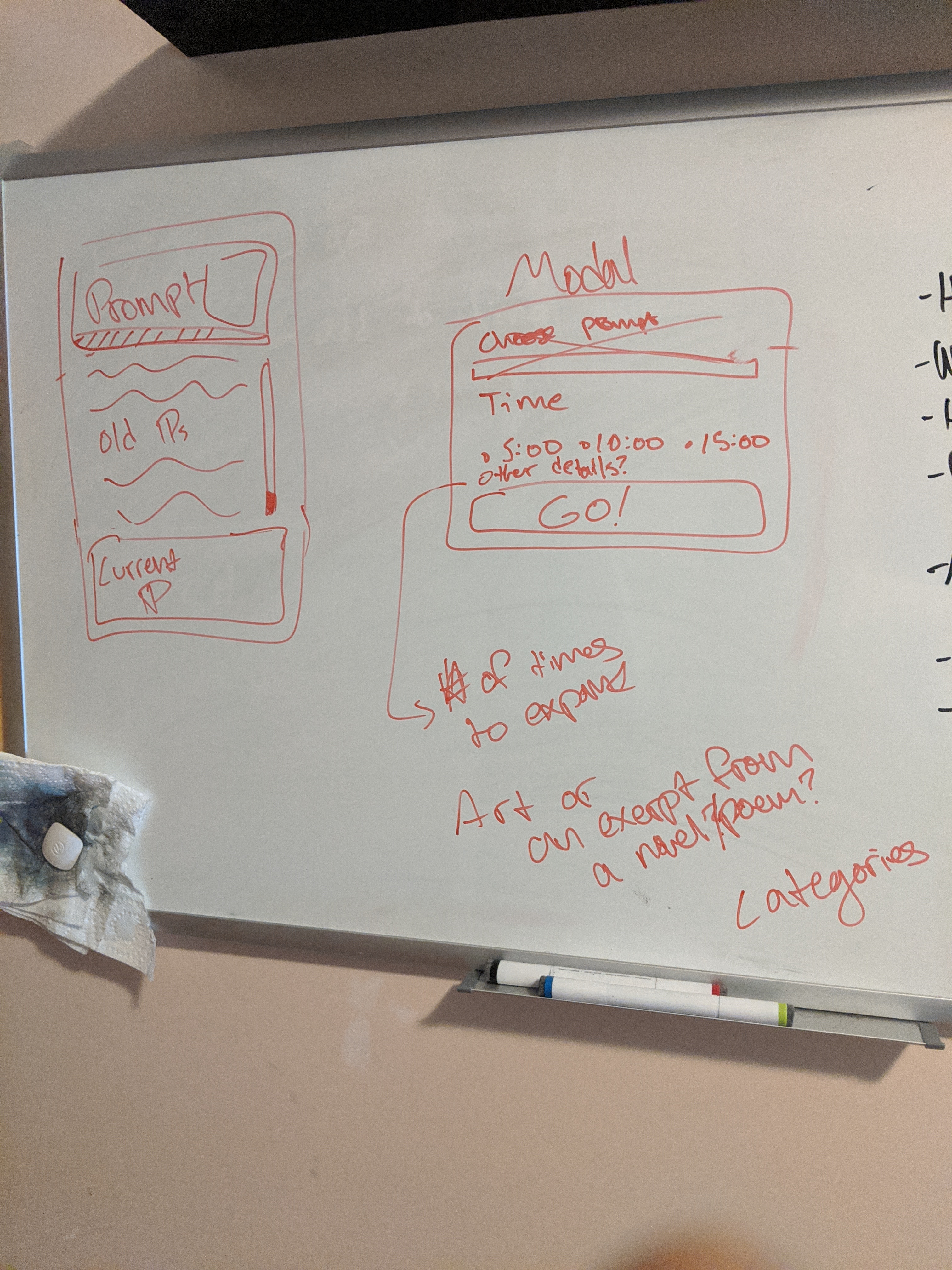
First, I created a new React app project and planned out how my components were going to be laid out. I started by sketching out what I wanted it to look like on my whiteboard.

The sketch on the left is the main drawing panel, and the one on the right is the modal that allows you to customize your sprint. As you can see on the left, the paragraph currently being written is highlighted, while the rest of the sprint is displayed above. I wanted to make it so that each time the user pressed enter for a new paragraph, that paragraph was added to the sprint in the “Old Paragraph” area and could no longer be edited. That way, the user would be forced to keep going and couldn’t spend too much time going back and editing.
The modal would be very simple, with the option to have a five, ten, or fifteen minute sprint, and possibly some additional options such as what sort of prompt the user wanted. It was here that I first came up with the idea to use a piece of artwork or a quote as inspiration, rather than simply using a generic writing prompt. I felt that this would provide a more freeform direction for the user, and as I’ve often felt that writing prompts are too bland to generate good writing, this seemed like an interesting alternative.
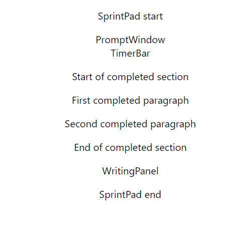
Now that I had my basic look, I began to code. I started by creating a bunch of empty React components to outline how I wanted my structure to look.

At this point, the app was essentially a table of contents, but the basic structure can be seen. There will be a PromptWindow that shows the prompt or image, also containing a TimerBar that shows how much time is left. Form there, there is the completed section, consisting of a list of paragraphs that have already been typed in. Finally, the WritingPanel is where the user actually types the current paragraph.
I then went through and implemented the various components one by one.
Coding the Components
The entire writing surface is surrouneded by a SprintPad component, which simply consists of a Container, a Box, and a Paper, all Material-UI components. It then holds the three main components of the pad: the PromptWindow, the CompletedSection, and the WritingPanel.
const SprintPad = () => {
  return(
    <Container>
      <Box my={2}>
        <Paper variant="outlined">
          <PromptWindow />
          <CompletedSection />
          <WritingPanel />
        </Paper>
      </Box>
    </Container>
  )
}
The PromptWindow itself consists of several components: an ImagePrompt, a TextPrompt and the TimerBar. Both the prompt components will be populated from a list, possibly using an API. The TimerBar shows how much time is left in the sprint; for now it has a dummy amount.
const PromptWindow = () => {
  return (
    <Box p={2}>
      <Paper>
        <Grid container>
          <ImagePrompt />
          <TextPrompt/>
        </Grid>
        <TimerBar progress={60}/>
      </Paper>
    </Box>
  )
}

const TextPrompt = (props) => {
  return (
    <Grid item xs={6}>
      <Box m={2} fontStyle="italic">
        <Typography align="left">
          {props.text}
        </Typography>
      </Box>
    </Grid>
  )
}

const ImagePrompt = (props) => {
  return (
    <Grid item>
      <Box m={2}>
        <img src={} height={200}/>
      </Box>
    </Grid>
  )
}

const TimerBar = (props) => {
  return (
    <LinearProgress
      variant="determinate"
      value={props.progress}>
      TimerBar
    </LinearProgress>
  )
}
The CompletedSection component is just a list of CompletedParagraph components, each one generated when the user begins a new paragraph. For now, I put in some basic dummy text.
const CompletedSection = () => {
  return (
    <Box px={3}>
      <CompletedParagraph text="First completed paragraph"/>
      <CompletedParagraph text="Second completed paragraph"/>
      <CompletedParagraph text="'And now some dialogue'" />
    </Box>
  )
}

const CompletedParagraph = (props) => {
  return (
    <Typography
      variant="body1"
      component="p"
      align="left"
      paragraph={true}>
      {props.text}
    </Typography>
  )
}
Finally, the WritingPanel is a very simple component, consisting of a TextField and a few boxes to center it.
const WritingPanel = () =>{
  return (
    <Box m={2}>
        <Box p={2}>
          <TextField
            fullWidth
            multiline
            placeholder="Get inspired!"
          />
      </Box>
    </Box>
  )
}
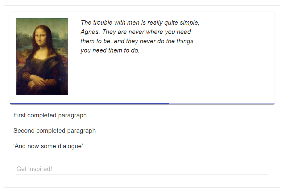
All together, the components look something like this:

It’s very simple and clean, although I might be changing some of the colors. Overall, however, I like the basic nature of it; it keeps things from being too complex and distracting you while you write. Similarly, I don’t show the actual amount of time left because I don’t want too many moving parts to catch the eye.
Modal Components
I wrote out the modal that provides customization options in a similar way. I also made my first use of the useStyles hook that Material-UI provides, although I hope to more fully customize things later.
const useStyles = makeStyles({
  root: {
    outline: 0,
  }
})

const SettingsModal = (props) => {
  const classes = useStyles()
  return (
    <Modal open={props.open} >
        <Box m={3} className={classes.root}>
          <Paper variant="outlined">
            <SettingsTitle />
            <TimePicker />
            <Instructions />
          </Paper>
        </Box>
    </Modal>
  )
}
Here, the SettingsTitle component simply provides the title of the modal, the TimePicker is the form that allows for customization, and the Instructions component provides a dropdown with instructions on how the app will work.
The TimePicker component provides two main areas of customization: it allows the user to decide how long to write, and allows them to choose if they want an image prompt, a text prompt, both, or neither. It’s essentially a bunch of form controls and labels.
const TimePicker = () => {
  return (
    <Grid container justify="center">
      <FormControl
      component="fieldset">
        <RadioGroup row value="10">
          <FormControlLabel
            value="5"
            control={<Radio />}
            label="5 minutes"
            labelPlacement="bottom"/>
          <FormControlLabel
            value="10"
            control={<Radio />}
            label="10 minutes"
            labelPlacement="bottom"/>
          <FormControlLabel
            value="15"
            control={<Radio />}
            label="15 minutes"
            labelPlacement="bottom"/>
        </RadioGroup>
        <Box mt={2}>
          <FormGroup row>
            <FormControlLabel
              control={<Checkbox checked/>}
              label="Include image"/>
            <FormControlLabel
              control={<Checkbox checked/>}
              label="Include excerpt"/>
          </FormGroup>
        </Box>
        <Box mt={2}>
          <Button
            variant="contained"
            fullWidth>
            Get Started!
          </Button>
        </Box>
      </FormControl>
    </Grid>
  )
}
The Instructions component makes use of an ExpansionPanel componet and the useStyles hook to create a small dropdown menu that explains how the app works. Since the app is pretty simple, I don’t think it will need much more than this, but if I get feedback requesting additional information, I may change this.
const useStyles = makeStyles({
  outer: {
    boxShadow: "none",
  },
  panel: {
    fontSize: "1rem",
    color: "darkgray"
  },
  panelText: {
    color: "black"
  }
})

const Instructions = () => {
  const classes = useStyles()
  return(
    <Box mt={2} mb={1}>
    <Grid container justify="center">
      <ExpansionPanel className = {classes.outer}>
        <ExpansionPanelSummary className={classes.panel}>
            How does this work?
        </ExpansionPanelSummary>
        <ExpansionPanelDetails classname={classes.panelText}>
            Simply decide how long you want to write for, and [NAME] will begin to count down. To encourage writing as fast as possible, you won't be
            able to delete any paragraph once you have completed it. If selected, a quote and a picture will be provided at random for inspiration,
            but you can deselect these options or just ignore them if your muse takes you elsewhere.
        </ExpansionPanelDetails>
      </ExpansionPanel>
    </Grid>
    </Box>
  )
}
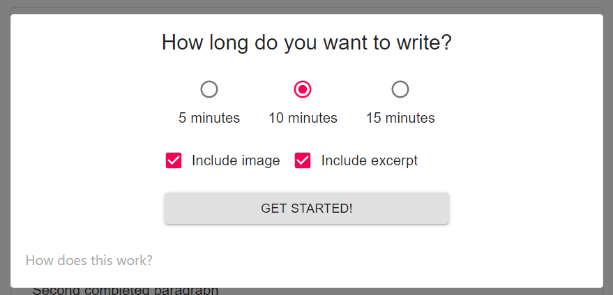
Taken together, the modal looks like this:

It’s simple and gets the job done.
Conclusions
I will probably make a few changes to this design before all is said and done, most notably with the color scheme. I find that darker colors provide a better inspiration with this sort of thing. But I like the basic look and I think that I have enough pieces in place to begin adding functionality. Overall I have enjoyed this project so far; it’s expanded my familiarity with Material-UI components and my ability to sketch out layouts has improved. Looking forward to putting in the guts, so keep an eye out for that in my next post.