Time for a slight change of pace. As I’ve been winding down work on the backend (although there’s still a fair amount to do), I’ve also been spending time teaching myself React, which I plan to use to build the frontend of my app. Whereas previously I used a combination if jinja templating and jQuery, that whole model felt outdated from the beginning (especially the jQuery), and I didn’t feel like I was developing skills that a modern full-stack developer needs. I first learned about React a few years ago and tried to learn it then, but at the time I knew very little JavaScript and even less about web development, and I didn’t get very far.
This time has been different, however. While I’m not using the same frontend materials this time around, I’m bringing my newfound knowledge of HTML, CSS, and JavaScript to the table, and I’m pleased to report that learning was much smoother this time around. I’m not going to spend a bunch of time on the details of the tutorials I went through but this course was particularly useful for me. I really like Bob Ziroll’s teaching style.
For my first small React project, I decided to make a calculator. Yes, it’s been done before, but I feel like a calculator effectively covers all the bases: you have to create a number of different components, provide a certain level of functionality, and make it look good in a neat box. Additionally, I decided to use a component library for the exercise, as I didn’t want to spend a bunch of time working out a theme, and I think it’s important to know more than just the base React system. I’ll be using Material UI for this project, as it’s the most popular React component library around, and I like the way it looks.
I’m going to split this post into two parts. The first concerns building the layout of the app, and the second will concern adding the functionality. I’m doing it this way to conform with the “smart/dumb component” dichotomy, and because building layout and building functionality sort of engage two different areas of my brain. So, without further ado, let’s get to it.
Basic Components
First off, I started by thinking through the basic components that would be needed to build the calculator. I wanted to design them in such a way that they could be easily reused, so that I wouldn’t have to manually set a bunch of attributes each time I wanted a new component.
For the case of a calculator, there are really two separate component types: Buttons and the Display. This keeps things nice and simple. I started with the Buttons, designing a BaseButton component that could then be build on into various, more specific, buttons.
import React from "react"
import {
  Button,
  Box
} from "@material-ui/core"

export const BaseButton = (props) => {
  return (
    <Box width={props.width} m={1}>
      <Button
        variant="contained"
        color={props.color != null ? props.color : "default"}
        disableElevation
        onClick={props.clickHandler}
        fullWidth="true">
        {props.label}
      </Button>
    </Box>
  )
}
This class essentially defines all the basic attributes that I want from the Button Material-UI class, including that it uses the “contained” variant and has no elevation. I also surround the button with a Box component and set the fullWidth variable to true, allowing me to resize the button as necessary. The rest of the components are passed in through the props attribute, including what happens when the button is pressed, the color of the button, and what’s on the button.
From this base class, I defined two additional classes: a NumButton class for the digits 0-9 and a FuncButton class for all other buttons (so named because clicking on them executes some sort of function).
export const NumButton = (props) => {
  return (
    <BaseButton
      label={props.number}
      width={props.width}
      clickHandler={()=>console.log(props.number)}
      width={props.width}
      />
  )
}

export const FuncButton = (props) => {

  return (
    <BaseButton
      label={props.label}
      clickHandler={props.func}
      color={props.color}
      width={props.width}
      />
  )
}
These two are largely the same, except NumButton uses a different placeholder function, but even now that I’m looking at them for the blog post, I can see that I should probably combine them further; there’s too much repeated code here. So look for that later when I add some finishing touches.
The Layout
I separated the buttons into three different groups, which I’m informally calling “Pads.” Each Pad makes use of the Box and Grid components to lay out their associated sets of buttons. They also all take a single color prop in and pass it to the children buttons, ensuring that each set has a uniform color.
The KeyPad stores the numbers 0-9, as well as the decimal (“.”) symbol.
import React from "react"
import {Grid, Box} from "@material-ui/core"
import {NumButton, FuncButton} from "./Buttons"

const KeyPad = () => {
  return(
    <Box display="inline-block">
        <Grid container>
          <NumButton number={7}/>
          <NumButton number={8}/>
          <NumButton number={9}/>
        </Grid>
        <Grid container>
          <NumButton number={4}/>
          <NumButton number={5}/>
          <NumButton number={6}/>
        </Grid>
        <Grid container>
          <NumButton number={1}/>
          <NumButton number={2}/>
          <NumButton number={3}/>
        </Grid>
        <Grid container>
          <NumButton number={0} width="60%"/>
          <FuncButton label={"."} func={()=>console.log("decimal")}/>
        </Grid>
    </Box>
  )
}

export default KeyPad
Note how I take advantage of the fact that my buttons have customizable width to give the “0” button a larger width (as is often the case on calculators).
The OperationsPad stores the basic operations: “+, -, ×, ÷, =”. I also created a placeholderFunction that simply prints out the name of the operation that will occur (since right now I’m only worrying about how everything looks).
import React from "react"
import {FuncButton} from "./Buttons"
import {Grid, Box} from "@material-ui/core"

const OperationsPad = (props) => {

  const placeholderFunction = (val) => console.log(val)

  return(
    <Box display="inline-block">
      <Grid
        container
        direction="column">
        <FuncButton
          label="+"
          func={()=>placeholderFunction("+")}
          color={props.color}
        />
        <FuncButton
          label="-"
          func={()=>placeholderFunction("-")}
          color={props.color}
        />
        <FuncButton
          label="×"
          func={()=>placeholderFunction("×")}
          color={props.color}
        />
        <FuncButton
          label="÷"
          func={()=>placeholderFunction("÷")}
          color={props.color}
        />
        <FuncButton
          label="="
          func={()=>placeholderFunction("=")}
          color={props.color}/>
      </Grid>
    </Box>
  )
}

export default OperationsPad
Finally, the AdditionalFunctionsPad (I know, I was running out of name ideas) stores the extraneous functions that don’t fit elsewhere, such as clearing the screen and changing a number from positive to negative.
import React from "react"
import {FuncButton} from "./Buttons"
import {Grid} from "@material-ui/core"


const AdditionalFunctionsPad = (props) =>{
  return(
    <Grid container>
      <FuncButton
        label="AC"
        color={props.color}/>
      <FuncButton
        label="%"
        color={props.color}/>
      <FuncButton
        label="+/-"
        color={props.color}/>
    </Grid>
  )
}

export default AdditionalFunctionsPad
These three pads are then combined in the main App.js, with a few Box and Grid components to facilitate layout.
I also created a CalculatorContainer component, which is basically just a Container wrapper to make sure everything looks neat and tidy.
import React from "react"

import {Paper, Container, Box} from "@material-ui/core"

const CalculatorContainer = (props) =>{
  return(
    <Container>
      <Box mt={2} align="center" display='inline-block'>
        <Paper mt={2}>
          {props.children}
        </Paper>
      </Box>
    </Container>

  )
}

export default CalculatorContainer
Here’s everything put together:
import React from 'react';
import {
  Button,
  Container,
  CssBaseline,
  Grid,
  Box,
  ThemeProvider
} from '@material-ui/core'
import KeyPad from "./components/KeyPad"
import Display from "./components/Display"
import CalculatorContainer from "./components/CalculatorContainer"
import OperationsPad from "./components/OperationsPad"
import AdditionalFunctionsPad from "./components/AdditionalFunctionsPad"
import theme from "./Theme"
function App() {

  return (
    <React.Fragment>
      <ThemeProvider theme={theme}>
        <CssBaseline />
        <CalculatorContainer>
          <Grid
            container
            direction="row">
            <Box>
              <AdditionalFunctionsPad/>
              <KeyPad />
            </Box>
            <OperationsPad />
          </Grid>
        </CalculatorContainer>
      </ThemeProvider>
    </React.Fragment>

  );
}

export default App;
Note also that I’m using a ThemeProvider class here. I defined my theme in a separate folder, making use of Material-UI’s colors to ensure consistency. To copy a basic calculator look, I went for a gray primary color and an orange secondary.
import React from "react"
import {ThemeProvider} from "@material-ui/core"

import { createMuiTheme } from "@material-ui/core/styles"
import grey from '@material-ui/core/colors/grey'
import orange from '@material-ui/core/colors/orange'

const theme = createMuiTheme({
  palette: {
    primary: {
      main: grey[400]
    },
    secondary: {
      main: orange[300]
    }
  },
  status: {
    danger: 'orange',
  },
})


export default theme
I then added these colors to the individual keypads, like so:
<OperationsPad color="primary"/>Put it all together, and here’s what you get.
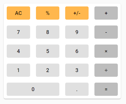
Not too shabby, no? But it still needs a display. Becuase the display is primarily going to involve function, my implementation here is fairly simple: a Paper and a Typography object that is drawn across the top of the calculator. It shows a static 0 right now, but this is just a placeholder.
import React from "react"

import {Paper, Typography, Box} from "@material-ui/core"

const Display = () =>{
  return (
    <Paper elevation={0} variant="outlined">
      <Box mx={2} my={1}>
        <Typography
          variant="h5"
          align="right">
          0
        </Typography>
      </Box>
    </Paper>
  )
}

export default Display
All together, here is the completed basic calculator look.
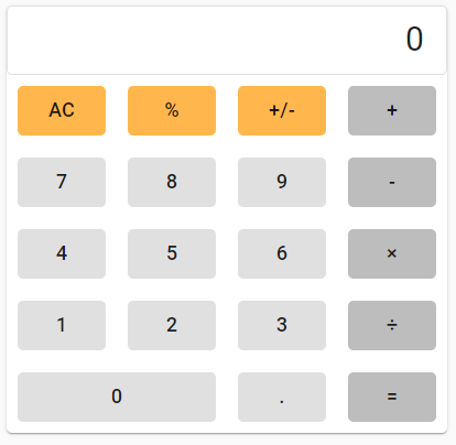
And there you have it! It still doesn’t do anything, but the look is there and I have my structure, which should hopefully make adding the functionality a much easier process. But that’s for next time. Stay tuned!